
How to Use Your Logo & visual identity Files
When it comes to your visual identity, you shouldn’t feel lost.
I aim to empower business owners to use their designs to their full potential.
STEP 1:
Getting started
Visual identity definition & brand guide
A visual identity isn’t just about making things look cool—it’s how your brand stands out and speaks without saying a word.
Great design goes beyond aesthetics; it’s a powerhouse for telling your brand’s story. Every touchpoint—your logo, website, social media, print materials—creates a vibe that pulls people in and makes them connect with your business before they ever meet you.
Your logo? It’s your brand’s fingerprint, but it’s just the start. It sets the tone, but your entire visual identity needs to play in sync. If your branding feels disjointed—like your logo is just slapped onto random designs—you’re missing the magic. Cohesion is key. Let’s make sure your visuals don’t just match but amplify what makes your brand unique.

Brand guide
Your brand guide is the playbook that keeps your visuals tight and on point—it breaks down all the design choices and how they work together to keep your brand looking sharp.
When you’re handing off work to a printer or another designer, this guide is your secret weapon. Give them the file, and they’ll have everything they need to make sure your brand stays consistent, not a game of design telephone.
If you’re DIY-ing your own materials, don’t skip the details—stick to your brand’s fonts, exact color codes, and style rules. The little things matter, and keeping them in check ensures your brand stays cohesive and instantly recognizable across everything you put out into the world.
STEP 2:
Your Logo Suite
What do we mean by the terms “primary logo,” “secondary logo,” “brand marks,” “submarks”?
Primary Logo

Your primary logo is the main logo design that should be used to represent your brand. It includes your full business name.
i
secondary Logo
Secondary logos are the MVPs of versatility—they’re alternate versions of your main logo that keep your brand looking fresh and functional no matter where it shows up.
Got a tall, vertical logo? Perfect for business cards or standing banners. But when you need something wide for your website header or a market sign, that’s where a horizontal version comes in. And for tight spaces—like your social media profile pics—a round or compact logo keeps things clean and recognizable.
Bottom line: different spaces call for different formats, and having solid secondary logos means your brand always fits, stands out, and stays consistent.
r


submark

Brand marks, submarks, alternate marks—different names, same idea. They’re like your logo’s cool cousins—related, familiar, but not identical.
These variations give your brand the flexibility to stay fresh without slapping the same logo on everything. Perfect for merch, apparel, packaging, stickers, social media, and more, they keep your brand looking cohesive while letting you mix things up.
Think of them as design cheat codes: more ways to showcase your brand’s identity while keeping it all feeling like part of the same family.
w


together, all of these logos make up your logo suite
STEP 3:
Your file type guide
You just got your final logo, and now there’s a whole folder full of files—some you recognize (.jpg, .pdf) and some that look like another language (.svg, .eps). Some open just fine, others? Not so much.
You’re ready to put your logo to work, but where do you even start? Don’t worry—I’ve got you. The next step breaks down exactly what each file is for and when to use it.
What are all these files for?
-
Use for print – Anything physical (business cards, packaging, signs).
-
Use for web – Anything digital (website, social media, email).
-
Transparent background – No annoying white box behind your logo.
-
Can be enlarged to any size – Stays crisp at any scale; if this isn’t checked, enlarging = blurry mess.
-
Editable for a designer – Can be opened in Adobe Illustrator; if a printer or designer says, “Send me the vector file,” this is what they mean!

What To USE Where...
Small print (apparel, business cards, rack cards, brochures, etc.)
.pdf - if designing yourself
.eps, .ai - send to printer/designer
Large Print (Window decal, billboard, large sign, vehicle wrap, etc.)
.pdf - if designing yourself
.eps, .ai - send to printer/designer
WEB
All web platforms (website, digital letterhead, social media, watermark on digital photos, etc.
.png - if designing yourself
.svg, .png - send to printer/designer
STEP 4:
Using your branding
Consistency breeds trust.
The secret to strong branding? Keeping everything consistent.
When your branding is locked in, it:
✔ Builds brand recognition
✔ Looks legit and professional
✔ Builds trust with your audience
And visual consistency starts with your colors and fonts. If those are all over the place, your brand feels scattered, customers get confused, and you lose that connection. Keep it tight, keep it cohesive—because consistency isn’t just about looking good, it’s about building trust.
Using Your Colors
CMYK is a color code used to produce colors for PRINT.
RGB is a code used to produce colors for that live on a screen.
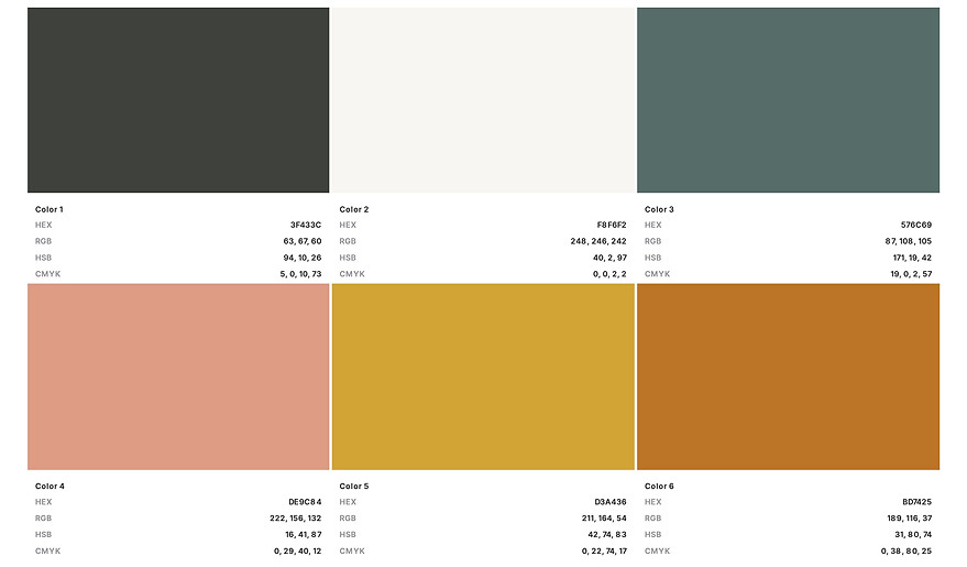
Any time you’re creating a design for print use (such as a rack card, menu, banner, etc.), input your CMYK numbers (NOT your HEX code or RGB numbers).
Anytime you're creating a digital design use HEX which Starts with # and includes six letters/numbers.
Use this code to apply the color to your website, social media graphics, or anywhere else online or on a screen
Using Your fonts
Using the same fonts across everything your brand puts out keeps your look polished and professional.
Your brand guide spells out exactly which fonts to use. Stick to it. Mixing random fonts throws off your branding and weakens recognition. Keep it consistent, keep it strong.